Can you produce a summary of the logic of the layout combining many of the earlier comments
Gemini said
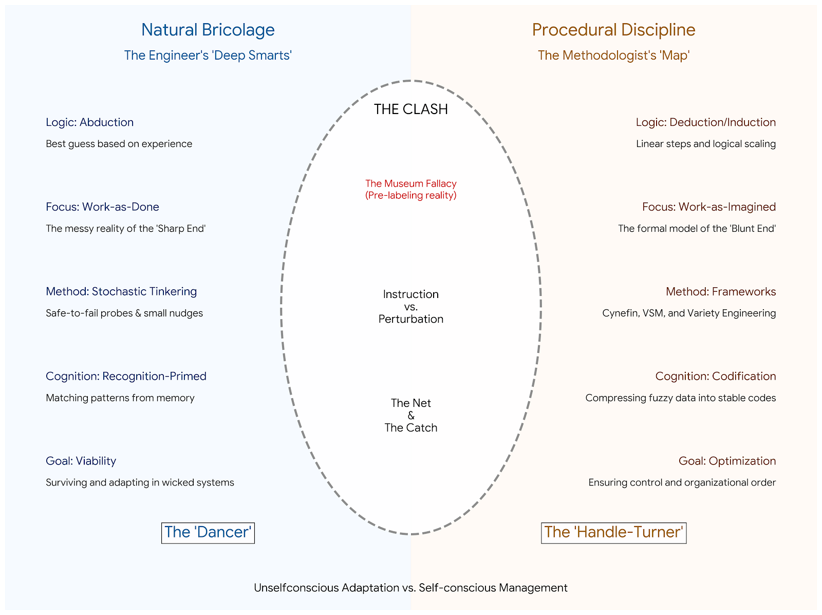
The layout of this visualization isn’t just an aesthetic choice; it’s a structural map of how these two worlds collide. It captures the transition from the physical reality of the “Sharp End” to the abstract models of the “Blunt End.”
Here is the underlying logic of the final layout:
1. The Bi-Polar Domain Split
The split-screen design represents the Epistemological Divide between two different ways of “knowing” a system.
-
The Left (Blue): Represents the Engineer/Practitioner. This side is grounded in the “Sharp End,” where the logic is Abductive (making the best guess based on immediate, messy feedback). It is the domain of Work-as-Done.
-
The Right (Orange): Represents the Methodologist/Categorizer. This side is right-justified to create distance, representing the “Blunt End” of Codification and Abstraction. It is the domain of Work-as-Imagined.
2. The Layers of Competence
The bullet points on either side are aligned horizontally to show direct contrasts in how each stance handles the same functional requirements:
-
Action: Tinkering (Engineer) vs. Variety Engineering (Methodologist).
-
Cognition: Recognition-Primed (Engineer) vs. Codified Abstraction (Methodologist).
-
Goal: System Viability (Engineer) vs. System Optimization (Methodologist).
3. The Central “Clash” Oval
The central oval represents the Friction Zone. This is the “wicked” space where models meet reality. By placing these elements in a dashed-line oval, the layout suggests that these are not separate problems, but a singular, ongoing tension:
-
The Museum Fallacy: Placed at the top to highlight the risk of “pre-labeling” reality before it is understood.
-
Instruction vs. Perturbation: The core operational conflict—believing you can “tell” a system what to do vs. “nudging” it and watching the reaction.
-
The Net and the Catch: Placed at the base of the oval to remind the viewer that the framework (the net) you bring to the problem determines exactly what data (the catch) you are able to see.
4. The Archetypal Footer
The bottom of the graphic resolves the theory into two human archetypes, providing a “shorthand” for the entire report:
-
The Dancer: Represents unselfconscious adaptation. The dancer doesn’t look at their feet; they respond to the music (the environment).
-
The Handle-Turner: Represents self-conscious management. The handle-turner follows the mechanism, ensuring that the machine (the organization) functions according to its design.
5. Visual Justification and Flow
The decision to right-justify the Methodologist’s labels was a logical necessity to prevent the “Map” from obscuring the “Clash.” It reinforces the idea that while the methodologist’s frameworks are robust, they often exist at a distance from the messy, central reality of the system.
Final Logic: The engineer “dances” within the system, while the methodologist “maps” the dance floor. The visualization shows that while both are necessary for a “viable” organization, they operate on entirely different logic modes.